
Counterfactual predictions for mapping variables
Contents
4.5. Counterfactual predictions for mapping variables#
Up until this point, we have been using the function eensight.methods.prediction.activity.estimate_activity to estimate the activity levels given the energy consumption data. However, there is a flaw:
estimate_activityassumes that the highest consumption values (conditioned on the external variables such as the weather) always correspond to activity levels of1.
While this is correct for the baseline period, what happens when there is an event that changes activity density?
As an example, fewer people may use the building due to restrictions imposed to deal with the COVID 19 pandemic. It does not make sense to continue assuming that the maximum value of activity remains 1. Instead, we need a strategy for adjusting the range of the activity levels to the new conditions.
The strategy of eensight is to reverse the way the activity estimation and the energy consumption prediction work:
For events that affect impact variables (such as an energy retrofit):
An energy consumption model is trained on pre-event data.
The energy consumption model that was trained on pre-event data is used to create counterfactual predictions given post-event activity levels and external conditions.
For events that affect mapping variables:
The pre-event consumption predictive model is used to estimate post-event activity levels. This is done by finding the activity levels that force the output of the model to match with the currently observed energy consumption. Note that if only mapping variables have changed, the consumption model is still accurate when predicting energy consumption.
The pre-event consumption predictive model is used to create counterfactual predictions given the estimated post-event occupancy levels.
This section explains the relevant eensight pipeline (called adjust) through an example.
%load_ext autoreload
%autoreload 2
import pandas as pd
import matplotlib.pyplot as plt
import matplotlib.ticker as ticker
from catboost import CatBoostRegressor

from eensight.methods.prediction.baseline import UsagePredictor
from eensight.methods.prediction.activity import adjust_activity, estimate_activity
from eensight.utils import load_catalog

plt.style.use("bmh")

%matplotlib inline
A utility function:
def get_colorbars(fig):
    cbs = []
    for ax in fig.axes:
        cbs.extend(ax.findobj(lambda obj: hasattr(obj, "colorbar") and obj.colorbar))
    return [a.colorbar for a in cbs]
4.5.1. The b05 dataset#
The b05 data corresponds to the building from the Dryad Dataset.
Start with the train data:
catalog = load_catalog(store_uri="../../../data", site_id="b05", namespace="train")

X_train = catalog.load("train.preprocessed-features")
y_train = catalog.load("train.preprocessed-labels")
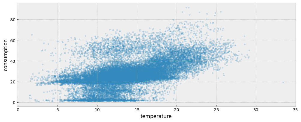
The following plot presents the energy consumption of the selected dataset as a function of the outdoor temperature:
fig = plt.figure(figsize=(12, 4.5))
layout = (1, 1)
ax = plt.subplot2grid(layout, (0, 0))

ax.scatter(X_train["temperature"], y_train["consumption"], s=10, alpha=0.2)
ax.set_xlabel("temperature")
ax.set_ylabel("consumption")
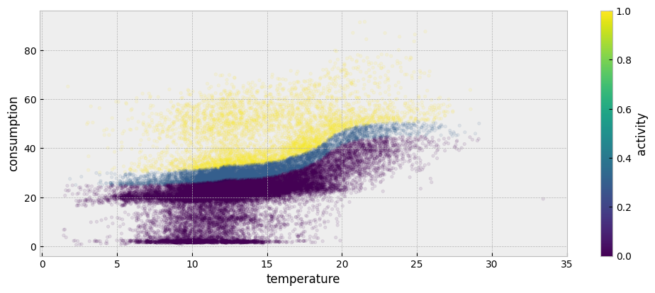
The first step is to fit an autoencoding model for the train period’s energy consumption data. Start by estimating activity:
act_train = estimate_activity(
    X_train,
    y_train,
    non_occ_features="temperature",
    exog="temperature"
)
The estimated activity levels are presented below:
plot_data = pd.concat(
    [
        X_train[["temperature"]],
        y_train,
        act_train.to_frame("activity")
    ],
    axis=1
).sort_values(by="temperature")

fig = plt.figure(figsize=(12, 4.5))
layout = (1, 1)
ax = plt.subplot2grid(layout, (0, 0))

plot_data.plot.scatter(
    "temperature",
    "consumption",
    color="activity",
    colormap='viridis',
    alpha=0.1,
    s=10,
    ax=ax
)

color_bar = get_colorbars(fig)[0]
color_bar.set_alpha(1)
color_bar.draw_all()
Then, fit a consumption model using weather and activity levels as features:
X_train_act = pd.concat(
    [
        X_train,
        act_train.to_frame("activity")

    ],
    axis=1
)

model = UsagePredictor(skip_calendar=True).fit(X_train_act, y_train)
We can use the scores_ attribute to see how well the model fits on the training and validation datasets:
model.scores_
{
    'learn': {'RMSE': 6.121432342155757, 'CVRMSE': 0.23162542663771996},
    'validation': {'RMSE': 7.531196416499583, 'CVRMSE': 0.3385382692652784}
}
Next, we assume that an event took place that changed activity intensity:
catalog = load_catalog(store_uri="../../../data", site_id="b05", namespace="apply")

X_apply = catalog.load("apply.preprocessed-features")
y_apply = catalog.load("apply.preprocessed-labels")
Using the first year’s data is enough:
X_apply = X_apply[X_apply.index.year == 2019]
y_apply = y_apply.loc[X_apply.index]
Although we don’t know the exact reason behind the differences in the train and apply data, it seems that there is an area in the train consumption data (colored in yellow) that is missing any observations in the apply consumption data:
BOOST_PARAMS = {
    "loss_function": "Quantile:alpha=0.999",
    "iterations": 600,
    "depth": 3,
    "allow_writing_files": False,
    "verbose": False,
}

threshold_model = CatBoostRegressor(**BOOST_PARAMS)
threshold_model = threshold_model.fit(X_apply[["temperature"]], y_apply)

mask = (y_train["consumption"] >=
        pd.Series(threshold_model.predict(X_train[["temperature"]]), index=X_train.index)
)

fig, (ax1, ax2) = plt.subplots(1, 2, sharey=True, figsize=(12, 4.5))
fig.subplots_adjust(wspace=0.04)

ax1.scatter(
    X_train["temperature"],
    y_train["consumption"],
    s=10,
    alpha=0.1
)

ax1.scatter(
    X_train.loc[mask, "temperature"],
    y_train.loc[mask, "consumption"],
    color="#feb24c",
    s=10,
    alpha=0.1
)

ax1.set_xlabel("temperature")
ax1.set_ylabel("consumption")
ax1.set_title("`train` data")

ax2.scatter(X_apply["temperature"], y_apply["consumption"], s=10, alpha=0.1)
ax2.set_xlabel("temperature")
ax2.set_title("`apply` data")
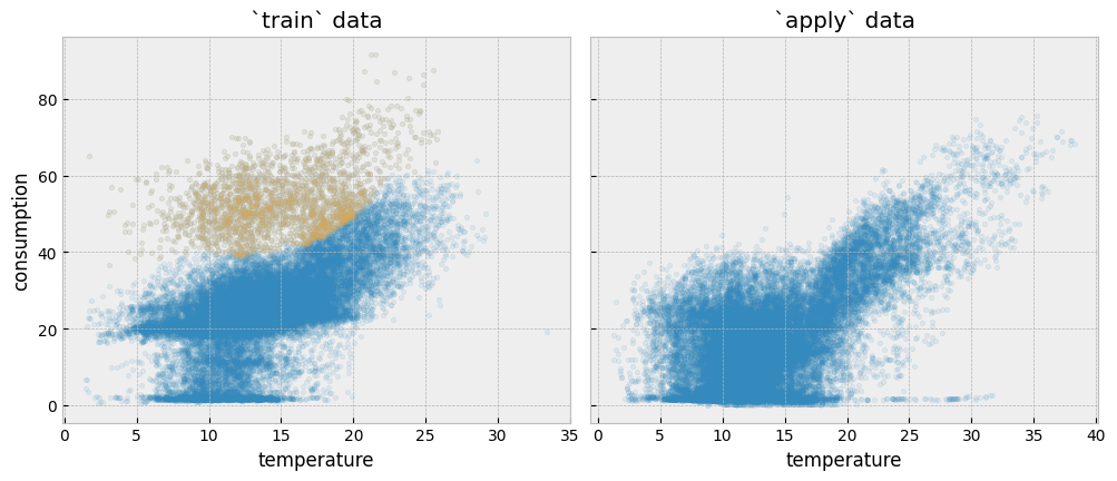
We can assume that something that used to happen inside the building during the train period does not happen any more in the apply period. In principle, activity changes are reflected in the activity variable.
First, let’s estimate the activity levels in the apply period using the estimate_activity function:
act_apply = estimate_activity(
    X_apply,
    y_apply,
    non_occ_features="temperature",
    exog="temperature"
)
We can plot the estimated activity levels for the train and the apply data side by side:
fig, (ax1, ax2) = plt.subplots(1, 2, sharey=True, figsize=(12, 4.5))

plot_data = pd.concat(
    [
        X_train[["temperature"]],
        y_train,
        act_train.to_frame("activity"),
    ],
    axis=1
).sort_values(by="temperature")

plot_data.plot.scatter(
    "temperature",
    "consumption",
    color="activity",
    alpha=0.1,
    colormap='viridis',
    s=10,
    ax=ax1
)

ax1.set_xlabel("temperature")
ax1.set_ylabel("consumption")
ax1.set_title("`train` data")

plot_data = pd.concat(
    [
        X_apply[["temperature"]],
        y_apply,
        act_apply.to_frame("activity"),
    ],
    axis=1
).sort_values(by="temperature")

plot_data.plot.scatter(
    "temperature",
    "consumption",
    color="activity",
    alpha=0.1,
    colormap='viridis',
    s=10,
    ax=ax2
)

ax2.set_xlabel("temperature")
ax2.set_title("`apply` data")

for color_bar in get_colorbars(fig):
    color_bar.set_alpha(1)
    color_bar.draw_all()

plt.tight_layout()
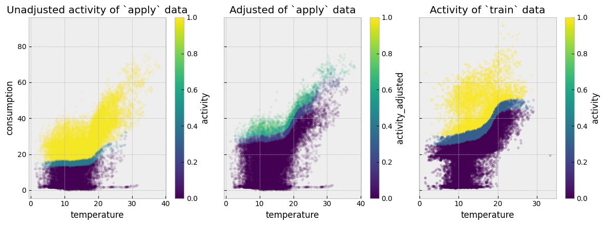
The problem with the plots above is that activity levels do not correctly map between the train and the apply periods. For a counterfactual model to work appropriately for this dataset, similar temperature and consumption values should correspond to similar activity levels (similar colors on the two plots).
4.5.2. Adjusting activity levels#
For events that affect mapping variables, the pre-event consumption predictive model is used to estimate post-event activity levels. This is done by finding the activity levels that force the output of the model to match with the currently observed energy consumption. This functionality is provided by the function eensight.methods.prediction.activity.adjust_activity.
adjust_activity needs the post-event data, as well as an energy consumption predictive model that was trained on pre-event data:
act_apply_adj = adjust_activity(X_apply, y_apply, model, non_occ_features="temperature")
Let’s put all activity estimates side by side:
fig, (ax1, ax2, ax3) = plt.subplots(1, 3, sharey=True, figsize=(12, 4.5))

plot_data = pd.concat(
    [
        X_apply[["temperature"]],
        y_apply,
        act_apply.to_frame("activity"),
        act_apply_adj.to_frame("activity_adjusted")
    ],
    axis=1
).sort_values(by="temperature")

plot_data.plot.scatter("temperature", "consumption", color="activity",
                         alpha=0.1, colormap='viridis', s=10, ax=ax1
)
plot_data.plot.scatter("temperature", "consumption", color="activity_adjusted",
                         alpha=0.1, colormap='viridis', s=10, ax=ax2
)

plot_data = pd.concat(
    [
        X_train[["temperature"]],
        y_train,
        act_train.to_frame("activity"),
    ],
    axis=1
).sort_values(by="temperature")
plot_data.plot.scatter("temperature", "consumption", color="activity",
                       colormap='viridis', alpha=0.2, s=10, ax=ax3
)

ax1.set_title("Unadjusted activity of `apply` data")
ax2.set_title("Adjusted of `apply` data")
ax3.set_title("Activity of `train` data")

for color_bar in get_colorbars(fig):
    color_bar.mappable.set_clim(vmin=0, vmax=1)
    color_bar.set_alpha(1)
    color_bar.draw_all()

plt.tight_layout()
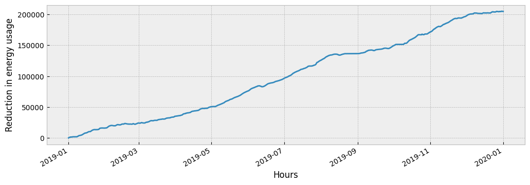
Finally, the pre-event consumption predictive model is used to create counterfactual predictions given the estimated post-event occupancy levels:
X_counter = pd.concat(
    [
        X_apply,
        act_apply_adj.to_frame("activity")

    ],
    axis=1
)

prediction = model.predict(X_counter)
The impact of the event is:
impact = prediction - y_apply["consumption"]
Typically, the impact is visualized as a cumulative variable:
fig = plt.figure(figsize=(12, 4))
layout = (1, 1)
ax = plt.subplot2grid(layout, (0, 0))

impact.cumsum().plot(ax=ax)
ax.set_xlabel('Hours')
ax.set_ylabel('Reduction in energy usage')
4.5.3. The adjust pipeline#
The adjust pipeline can be called from the command line as:
eensight run adjust --site-id b05 --store-uri ../../../data --namespace apply --autoencode
Note that adjust supports only the apply namespace.
Running the pipeline will create the following artifacts:
apply.activity-adjusted: The dataframe with the adjusted activity levels.
WARNING: If apply.activity-adjusted exists, when the predict and evaluate pipelines run in the apply namespace, they will use it instead of generating an apply.activity (for predict) or using an existing apply.activity (for evaluate). If you don’t want to use the apply.activity-adjusted, either delete it or run eensight in a new MLflow run.